A Quintessential Khmer Moment in Time

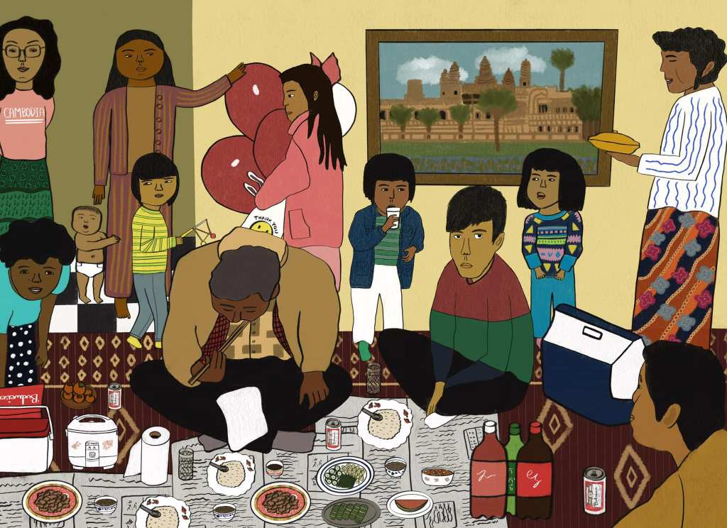
“Celebration,” digital illustration using Procreate, 2022.

Procreate brushes: Gesinski (inking), Melaleuca (textures)

Total time (approx): around 40 hours at least, over the course of 1 month/1.5 months

BACKGROUND

Most of my inspiration for drawing comes from witnessing ordinary people in my day-to-day life and on my social media feed. These people are “ordinary” in the sense that most of the people I draw are not famous. They are family, friends, coworkers, acquaintances. But I think there is something so extraordinary about humans who lead unassuming lives in and around my social circles, speckles of well-meaning flesh in my periphery. I, too, am a bag of well-meaning flesh trying to do my best and get through the day. I want to evoke that in my art. When I draw people, it feels intimate, even when I am not face-to-face with them but simply looking at a photograph as a reference. I almost feel like I know them a little more, as I draw lines to form the specific shape of their mouth, or their hair, or their hands.

Some time ago, I was visiting my mother and was flipping through some old photo albums. I came across a picture of what looked like a family gathering of some kind. I vaguely recalled it might have been someone’s birthday–perhaps mine, when I was a small child. I wasn’t featured in the photo, but judging by the setting, it looked like the living room of the apartment we lived in up until I was about five. There were multiple people of various ages in the picture, all caught in varying poses. Some were sitting down and eating; others were crowding the background. I spied my mom on the far left, wearing a polka-dotted dress, her hair in a short perm, reaching her hand down to grab a drink from a box. I spied my teenage cousin in the backdrop, dressed in all pink, carrying party balloons. The photo was a bit chaotic, and yet, through the chaos, there was an overwhelming sense of nostalgia, familiarity, comfort, and home. Whoever took this photo (perhaps my father) had unintentionally captured what I felt was a quintessentially Khmer moment in time: the 90s hairstyles and fits, the feast spread out on the floor, the pretty patterned kantael peeking out underneath, the cans of Budweiser, the liters of off-brand soda, the Tiger rice cooker with the flowers printed on the side, the distinctively Asian dishware with abstract and floral designs that you could buy at any Asian mom-and-pop shop near you, the plate of persimmons hiding in plain sight. I snapped a picture of this picture and favorited it on my phone. I knew I needed to draw it, and I knew it would take a long time.

These people were speckles of well-meaning flesh in my periphery, trapped in shades of time and place that spoke to me. I wanted to wait until I had the skill and experience to capture what it made me feel.

PROCESS

It took me 2 years before I mustered the nerve to try recreating the photo according to my own artistic interpretation. It didn’t need to be an exact replica, I decided, as long as it felt emotionally true to the essence of the picture. I started out very slowly, deciding to focus on illustrating one person at a time in the photo, then go from there. The first person I sketched out was the woman on the far right, a Ming (but likely not blood-related) I remember seeing sometimes when we were kids, before my father died and before we stopped going to church. In the photo, she wears a plain white long-sleeve shirt and carries a plain white dish in her hands. The blandness bothered me. I decided to embellish the details; I made the dish a golden yellow and added wavy blue lines to her blouse. It felt right to take some creative license, for some reason. In some ways I felt protective of the photo and who was actually in it; changing things made it feel safer to share publicly. And again, there was more of an emotional core I was trying to get to, not a biographical one.

I experienced several stops and starts for every couple of people I managed to draw. The project felt too big of an undertaking at times. There were days, weeks that I went without looking at it. Ironically, it was only when I truly began to take in the progress that I was making (about a third to halfway through) that my pace picked up. Suddenly I was in a rush to complete the drawing, while wanting to be as detailed as possible. The changes I hesitated to make at first were now incorporated without too much emotional handwringing. The color of my male cousin’s sweater. The baby clinging to its mother’s leg. The smiley-face bag my female cousin carried in her other hand (the hand not carrying the aforementioned tangle of balloons). The framed picture of the Angkor Wat temple on the wall. Everyone’s skin tones (I went for darker.) The design of the skirt worn by the woman on the top left in what had become a very crowded, eclectic composition. These details, and more, were all impulsively added or reinvented by me, the artist playing God. I splashed color and added spice to taste. Although the illustration had become a hybrid between fact and fiction, it was, overall and in my eyes, a very good snapshot of something that was emotionally real to me: family, culture, and connection, back in the day when things felt easier but probably weren’t, the “good” ol’ days when we didn’t know what we would lose.

FINAL THOUGHTS

I am proud of the time and effort I put into creating this illustration. I’ve never drawn this many people at once with such a painstaking level of detail, so this was definitely a challenge for me. But I always want to challenge myself in my creative pursuits; otherwise, I would never grow. I am particularly proud of the rice cooker, the tableware, the food, and the baby, as I feel these things are not the easiest to draw. I kind of wish I had squeezed other kinds of food into the foreground, or maybe depicted Cambodian hot pot as the entree; I also kind of wish I could redo the Angkor Wat painting. But as a perfectionist, there’s always going to be something I’ll want to change, so a part of my artistic practice has been blessing and releasing the nitpicking of details and embracing the imperfections–which just so happens to be a good motto for life in general, too.

The Art of Destroying Men

“Man-eater,” digital illustration using Procreate, 2022.

Procreate brushes: Gesinski Ink (Inking), Tarkine or Melaleuca (sorry can’t remember which one but they’re both Textures), Grid (Textures), Splatter (Spraypaints), Drip (Spraypaints)

Total time (approx): 3.5-4 hours

background

I’ve always been enamored and fascinated by art that depicts women enacting violence against men. This is not because this is the kind of violence I wish to see employed in real life as a solution to dismantling misogyny (I mean, structural oppression doesn’t get toppled just because a few men get beheaded). I just feel there’s something very powerful, cathartic, and subversive to see women artistically portrayed as instigators and agents of the kind of violence that many women disproportionately face in real life because of colonial and imperial cisheteropatriarchy. In a feminist imaginary, a woman dealing ruthlessly with her oppressor is the norm. And the gap between that fantasy and what is reality, feels achingly resonant and worth exploring through art, even if it is only as a means of coping in a violently misogynistic world that is largely outside of my individual control.

Connected to that is my fascination with praying mantises and the Internet lore of the female praying mantis feasting on her male mate after mating. After doing a little more research, I learned that this doesn’t actually happen very often and when it does, the cannibalization is typically observed in a lab setting and not in the wild, which is so interesting to me. I think it speaks to how individual behaviors can be a direct or indirect result of conditions created or a change in environment, which can be applied to reflect on how women and non-men behave as a means of survival in conditions created by patriarchy. I mean, this could just be the overthinker in me but I gotta put my English degree (ie a propensity to overanalyze and make connections that aren’t necessarily materially there) to use somehow!

process

I started by Googling pictures of praying mantises and ended up relying on two different pictures as references for my drawing. The trickiest part was getting the proportions of the body right. As I was drawing, I realized how intricate the body of a praying mantis is! There’s so many little details I overlooked before because it was like hey, it’s an insect, I mean how many parts can it have, being so small? I’ve also grown to appreciate how long and elegant their bodies are.

The head of the praying mantis, in case you hadn’t noticed, is based on my head in a selfie I recently took, hahaha. The disembodied head in the praying mantis’s claws is loosely based on Jake Gyllenhaal, not because I have a personal vendetta against Jake Gyllenhaal (although yes I am Team Taylor Swift and support her grudge against him), I just wanted to draw someone who looks (and is) kinda douchey.

For extra macabre detailing, I added blood splatters, a gouged out eye, and a bloody puncture in Jake Gyllenhaal Knockoff’s head. ❤

The background was the second toughest part for me. I wasn’t satisfied with having a very plain canvas. After much experimenting and virtually + proverbially throwing paint on the wall to see what would look good, I settled on having a partial grid background, which I liked because it kind of gave the composition a sort of dystopian, disorderly feel.

final thoughts

Overall, I’m pretty happy with what I created! I’m starting to question my choice in the background but I’m going to tell that little voice to STFU, cus I am NOT redoing this shit!! If I was more skilled and less lazy, I think I would have gone for a more naturalistic background but eh…I mean that would kind of go against what I learned about female praying mantises anyway (that they don’t actually cannibalize their mates in their natural habitats). Okay, no more overanalyzing!

Burning Cop Cars Are Hard to Draw

“Cats against cops,” digital illustration using Procreate, 2022.

Procreate brushes: Syrup (Inking), Tinderbox (Inking)

Total time (approx): 4.5-5 hours

Background

Sometimes I get struck with a vision of something I want to draw, which is typically a gradual accumulation of things I love, values I believe in, and politics I hold. This time it was a vision of a horde of cats (a flock of cats? a murder of cats?) flying in the air, with the words “CATS AGAINST COPS” featured somewhere prominently in the composition. Oh, and also a burning cop car somewhere, I mean how else am I going to drive the point around purr-lice abolition home?

It just made sense to me. I love cats. I am a catless cat person at the moment unfortunately (my roommate is anti-cat), but someday I hope to have one of my own (besides that very brief period in childhood in which I had a cat for maybe about two months before it got hit by a car and died RIP Tigger). BUT ALSO! Fuck cops! Also, I don’t know if you’ve seen that meme floating around about how cats are cool cus they don’t fuck with cops (unlike dogs), but I found it funny and even though I’m sure it was mostly if not completely a joke, the possibility of cats being anti-cop is just one more reason I love cats. So this vision was the perfect mishmash between an appreciation of felines and an abject disgust of state-sanctioned agents of white supremacy and capitalism.

Process

I started out with drawing the burning cop car. This is something I’ve been wanting to draw. Can anyone be a true radical artist if you haven’t managed to capture the iconic burning cop car in your work? And you know what, I’ve been putting it off because it just seems too fucking hard. I only have a couple of years of serious drawing under my belt (with zero formal teaching), and I struggle with dimensions, correct proportions, and basically drawing anything (I guess other than people) super lifelike. So I usually avoid drawing things like cars and fire (and also hands where I can help it, I am so bad at drawing hands, fingers are weirdly complicated!!!). But I do have this masochistic urge to challenge myself at the expense of my own anxieties and fears, so I told myself I’m just going to do my best and be satisfied as long as the end result could be mostly recognized as a burning cop car by the average person, precision be damned.

This is embarrassing but it took me like 2 hours to draw a cop car with flames coming out and around it. I was Googling lots of pictures of cop cars to base my drawing on, which is something I never ever thought up till now that I would ever do in my life. And now I’m never going to do it again, because I copied and pasted the one I drew into a new file so I can just keep using that one graphic over and over again anytime I’m in need of a cop car! Just please don’t look at it too carefully.

The rest of it was less stressful, but yes, time-consuming. I decided I would cut corners with the flying cats and draw really cartoony ones with the same body (with some cosmetic differences in terms of color and width but yeah I was literally copying and pasting from one cat silhouette I made). Most of the cats are just random figments of my imagination, but there are THREE cats based on existing fictional characters included: Princess Carolyn from Bojack Horseman (queen), Bob from the original Animal Crossing games on GameCube (not sure if he’s in later versions but I love him so much and had a huge crush on him as a kid I can’t explain it sorry), and the lucky cat aka the beckoning cat or “maneki-neko” in Japanese (I was today years old when I realized the cat is Japanese in origin, not Chinese).

Last but not least, the background took a while to do, even though I know it looks kind of simple. I always save the background for last because I see it as a way to accentuate what is in the foreground. (I don’t know if this is typical or not, I don’t know any norms when it comes to visual art!) This is the part I wing the most. I just play around and experiment with different colors and patterns and textures until I land on something that feels right. I didn’t want the background to be too plain, as that is not my style, but I also was realizing that having a busy background wasn’t going to work because the foreground was already pretty busy (I mean there’s 10 cats conspiring against the state), so I settled for 3 bright colors segmented into shapes to give the composition some form (look at me talking so artsy, I’m really just saying whatever though hahaha).

Final thoughts

Overall, I’m pretty happy with what I drew. The more I look at it, the more satisfied I am with what I did. (That tends to be the case with a lot of my work tbh.) There’s always a few things that make me go, “Damnit I should have put that there or made that bigger etc. etc.” but as an artist I’ve had learn when to tell that nagging inner voice to STFU. Also, I am really proud of how I drew the cat scratching the hood of the car. Like that is a weird angle of a cat and I think I pulled it off.

Thanks for reading. 🙂